.
Please pay close attention. This is kind of complicated. And irritating. A Toronto-based international design firm has taken on an assignment from WNYC Studio 360 in New York to (are you ready?) redesign Canada. Bruce Mau Design created the campaign to change the country’s image by teaching Americans to know Canada better, without benefit of beavers, hockey, Mounties or maple syrup. The creative team was exclusively American.
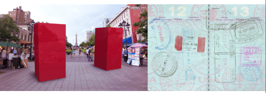
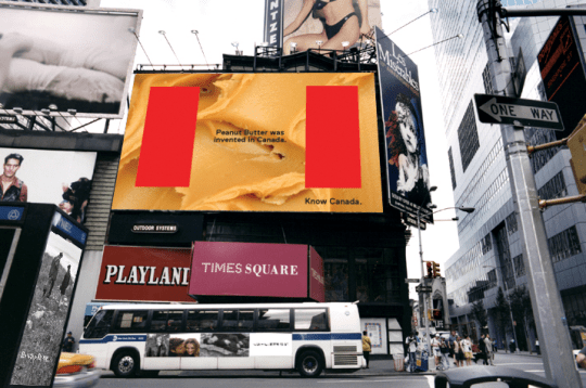
The two-bar red logo – yes it’s for the Canadian flag – is on T-shirts, bumper stickers, even a prospective passport stamp. The art of the Know Canada campaign is, well, to put it politely, trite. A video of accomplishments featuring Pamela Anderson in the Wonder Bra? Peanut butter is the best we can do for a billboard in Times Square?
Famous Canadians such as Justin Bieber and Margaret Atwood are framed between the red bars of the logo in posters and a TV spot. Kind of like those (yawn) Heritage Minutes on the CBC (yawn).
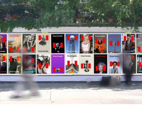 The concept campaign is being pushed hard by Studio 360, a production of Public Radio International and WNYC, known for inviting designers in for irreverent redesigns of everything from Monopoly to the gay flag. The idea is to take an outmoded identity – like Canada’s – and have experts tweak it into something more appealing. Parts of the campaign are fun, including some of the back-at-ya work from the CBC’s Jian Ghomeshi. He’s taken on a rebranding America campaign in collaboration with WNYC.
Know Canada isn’t really objectionable. It’s generating debate, and that’s good. But it’s mostly about broadcast ratings, and being hip and cheeky, not really about teaching Americans. Maybe we should keep our own counsel and forget about changing anyone’s mind. Me, I still think the now ancient I Am Canadian campaign was the best identity branding ever done. And it wasn’t even aimed at the Yanks.
Related articles
- Canada redesigned: U.S. public radio program rebrands the Great White North (news.nationalpost.com)
Discover more from Canadian Art Junkie
Subscribe to get the latest posts sent to your email.





How very strange to ask Americans to undertake the job of rebranding Canada… By the way I Totally agree with Rosie. But just for the record, I think it is impossible to ‘brand’ or ‘rebrand’ a whole country without upsetting/ frustrating people; most of us are aware of the stereotypes that emerge from attempting to do so. Being from Northern England nothing frustrates me more!! I Have never been to Canada but know that if/ when I do I am certain to find an abundance of hidden treasures in what is obviously a very beautiful country. I am also sure that Canadian people are used to having to ‘rise above’ this kind of thing with great success
.
Great points you make. And you’re right. We hear so much on this side of the border about how the Americans don’t know enough about Canada, or don’t give Canada credence, that many of us don’t listen very hard anymore. Appreciated.
Well, I’m living on the other side of the world and I think that Canada’s image is just fine. If it ain’t broke, don’t fix it!
You are right on point, as usual. There’s been considerable coverage in the Canadian media about exactly that point – that Canada’s doing just fine. This from the National Post in Toronto: “In 2010, the U.S.-based brand consulting firm FutureBrand named Canada the world’s most respected country brand, owing in part to the 2010 Winter Olympics and the award-winning “Keep Exploring” campaign commissioned by the Canadian Tourism Commission” Thanks for the comment.
Rebranding is the “hip” thing to do for businesses these days and I understand and applaud the idea of bringing Canadian flavours and successes to the fore in the US. However, that being said I take exception to the design – those 2 red stripes. They make me think of jail bars and they certainly detract from the pictures! Questionable design plus poor application all the way around!
Thanks for taking the time to leave your thoughts. It seems there’s a widespread aversion to those bars, for reasons you point out.
I can’t comment too intelligently at this point, but I can see both sides of this – fun on one level, inane on another. I do have to say that peanut butter is pretty damn important though. At least in my family. 😉
You always comment intelligently! I like the PB thought!
Boomer, I completely share your irritation. The funny thing is, I have been struggling with my own perception of the changing Canadian identity for the past couple of years now… and still am. I sink in to nostalgia, looking for (as an Art/Lit example) who will replace an Alex Colville.. or a Farley Mowat.. a Cape Dorset Co-op…? so for non-Canadians to attempt to define me is a r r o g a n t. Luckily we have Rick Mercer and “Talking To Americans” to fall back on when the urge to become impolite rears its ugly head……..and we do have look deep within our own country for all that is not trite.
…and I love Canadian Art Junkie for putting options out there…!
And we have so much that is not trite, but increasingly substantial, not to mention our rock solid economy, even when it sags a bit. It’s so interesting what you say about who’s going to replace the bright lights. I truly believe it will happen. I was in a gallery near St. Lawrence Market on the weekend looking at work by Nicotye Samayualie, the granddaughter of Cape Dorset elder Eliyakota Samayualie and I was so glad to see her starting up. It’s interesting that her generation’s art is a wonderful new version of the traditional co-op prints. Sorry, you really got me started here. I’m trying to say I think our arts/lit are strong enough to carry through. Thank you for that prompt!
Ultimately, I do think so too – Annie Pootoogook is awesome and international… and here on the West Coast the Hunt family is flourishing.. I thought of many others as well. It is almost impossible to keep our own council when we are sleeping with the elephant, but that is what I will strive to do because we can never be “known” by branding. As I thought about this post today (and I had a good time thinkin’ on it!) I came to the conclusion that I don’t care what the American perspective of Canada is… they are in my rear view world window, poor them!
I also think the stupid red bars will sink! (and btw, the Heritage moments are a snooze, but the wilderness moments with the Call of the Loon are forever, happily etched in my brain!)
sounds like a load of consumerist bollocks to me! I prefer what little Iknow (& admire) of Canada to remain as it is!
Love that reaction. Thanks very much!
🙂
I think that’s interesting. Need to chew on that for awhile.
Yep, very logical reaction. For me, anything that mixes nationalism with cross-border issues is fraught with complicated emotion.
I agree