Editor’s Note: The premiere of the new adaptation of this powerful novel caused a surge of interest in this post. Margaret Atwood says it’s not just the Hulu TV series. The book’s sales have surged, likely due to what some call the “Trump bump” for dystopian literature. Here’s the original post.
◊◊◊
It’s fascinating to see how a pair of Italian illustrators (twin sisters) conceived the images for A Handmaid’s Tale, the novel that propelled Canadian author Margaret Atwood to international recognition. Anna and Elena Balbusso have won a slew of 2012 awards for a new edition of Atwood’s futuristic story, published by the Folio Society of the U.K.
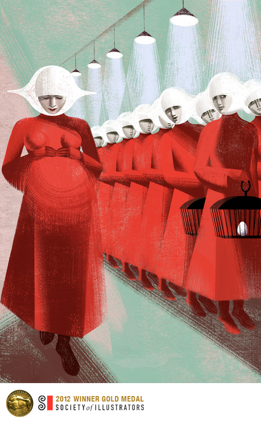
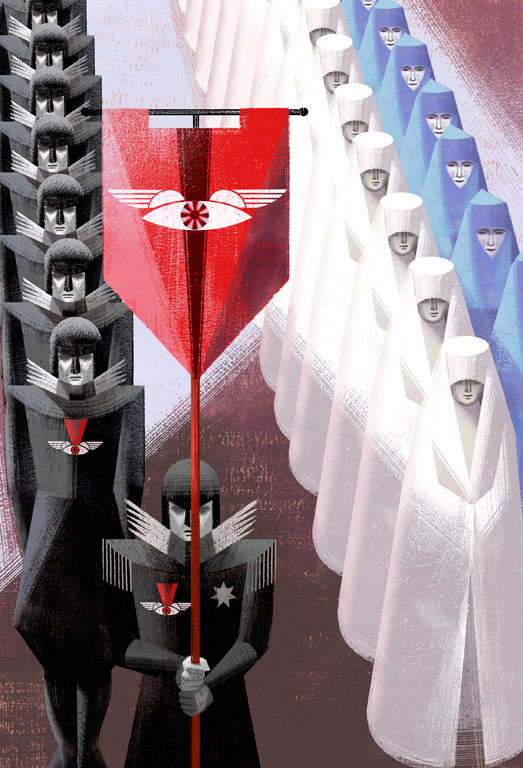
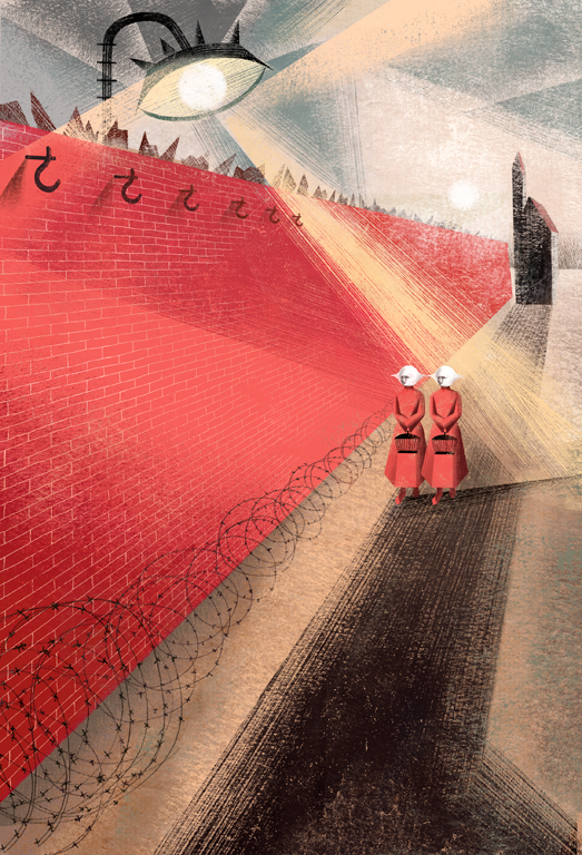
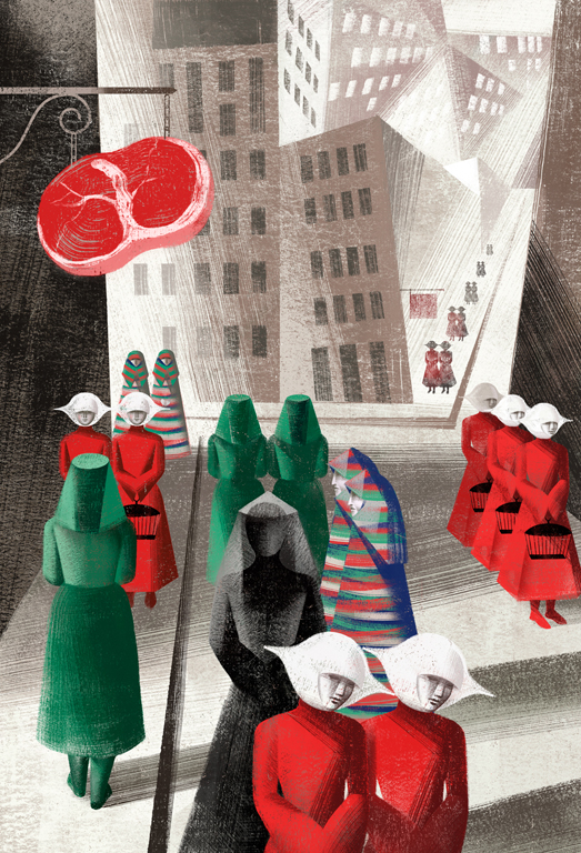
The narrator of the 1985 novel is the handmaid Offred, stripped of freedom and rights in a totalitarian republic carved from the former United States. Her job is reproduction. Anna and Elena Balbusso’s illustrations slam home the regimented and hierarchical structure of Atwood’s Republic of Gilead. (Above: Ceremony; Below: Wall)
The illustrations accurately reflect the chilling nature of Atwood’s cautionary tale.
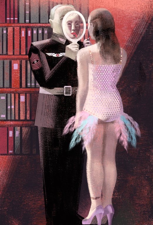
To give a visionary interpretation and to create the right atmosphere for the story, we chose a futurist tone with accentuated perspectives and strong light. We used few colours and with a prevalence of red, black and white. Futurism, Russian Constructivism and fascist-period design were our references. –Interview, Folio Society
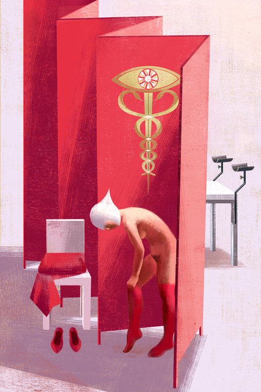 Above: Examination; Below: Lipstick and City
Anna & Elena Balbusso, twins from Italy, are based in Milan. Since 1994 they have worked as a freelance team illustrating in Italy, France, U.S., United Kingdom and the Republic of Korea. Their works have been published worldwide in a variety of media, including book jackets, magazines, newspapers, in-house corporate, ads, children’s books and classic novels.
The Balbusso website, here.
More of the Balbussos’ work, here.
Discover more from Canadian Art Junkie
Subscribe to get the latest posts sent to your email.

Oh, My! I almost missed this post. Would have been a shame. These girls are terribly creative illustrators! Thanks for this post!
Creative for certain, thanks.
The 2nd and 4th especially but all of these designs are excellent. thanks.
You’re welcome, glad you found them.
thanks. this is brilliant illustration. catching the mood perfectly.
It does indeed catch the mood brilliantly, almost eerily. Thanks.
Deserving winners. I’d say. They’re stunning illustrations, CAJ – what’s happening today? You keep presenting such want-able work, though perhaps in this case I might satisfy my avarice with the purchase of a special folio edition of an old favourite?t
Missed your comment earlier, but you’re right. I was kind of vibrating when I found these posts. You know (as I’m sure you do know) that blogging really crystallizes your thinking.
Yes, CAJ, you’re right about that, blogging can become part of the crystallisation process – I suppose because most things come at you unexpectedly, so you see things with clear, unguarded eyes. I can understand some of those images setting you ablaze!
PS Funny to have a note from you this morning because earlier I came across a photographer who’d captured a string of upturned red canoes at Lake Louise. It was a wonderful shot but I immediately thought of some of those paintings you’d shown us a while ago – how much more scope for imaginings there is in a painting – even the hyper-realists – than with a photograph. Is that a prejudice/limitation I place upon photography?
Such an interesting question, but I believe that’s why art is so engrossing. You start from a reality premise with a photo, no matter how it’s manipulated. A painting is more like a book – it gives you a base and you can take it on from there.
Umm – the book analogy is the way I always see it too.
These are amazing! And one of my favourite books!
Yes, also one of my favorites. I think these are stunning, and so appropriate.
Like, wow!
I know!
I LOVED that book and these illustrations are such a treat.
Yes, they did an amazing job, agree.
Have loved the novel since it was published, and these are wonderful!
They really catch the aura, don’t they.